Developers Guide Version 1.0
Template Tags
Change content such as Images, Text, Links, Font sizes and Font styling.
No tags are required as StampReady makes these kind of adjustment editable automatically.
Drag and Drop modules
To allow the user to drag and drop modules from the Modules bar into the Editing canvas, simply add data-module to the desired table, like so:<table data-module="hello_world"> <tr> <td>Hello World</td> </tr> </table>
Add Thumbnail
StampReady automatically generates a standard thumbnail whenever you haven't defined it. Simply add data-thumb to each table that holds the data-module tag in order to present a thumbnail. You can either use and absolute path to your own server and image file. Or use 'thumbnails/image.jpg/.png/.gif' when you've created a StampReady compatible .ZIP file (Note: include a folder named 'thumbnails' within the .ZIP.) Thumbnails should be saved with 250px in width, height can be variable.
Remove Sections
Same as above, simply add the data-module and it will automatically bind the remove function to your desired section.
Sort sections
Same as above, simply add the data-module tag and it will automatically bind the sortable function to your desired section.
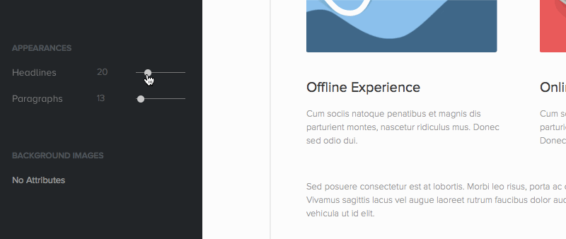
Change font sizes
To allow the user to change font sizes, simply add data-size to any element. You can also add the data-min and data-max tag to control the marges. Following this example, the user would be able to drag the range slider with a minimum value of 12px and a maximum value of 36px. However, the data-min and data-max template tag are not required. If you want to target multiple elements for the same slider, simply give each desired element the exact tag name.<!-- Change element font size. Minimum 12px, maximum 36px. --> <table> <tr> <td data-size="my specific element" data-min="12" data-max="36">Hello World</td> </tr> </table> <!-- Change multiple elements the same font size. Minimum 12px, maximum 36px. --> <table> <tr> <td> <h1 data-size="headline" data-min="12" data-max="36">Headline 1</h1> <p>Hello World 1</p> <h1 data-size="headline" data-min="12" data-max="36">Headline 2</h1> <p>Hello World 2</p> <h1 data-size="headline" data-min="12" data-max="36">Headline 3</h1> <p>Hello World 3</p> </td> </tr> </table>
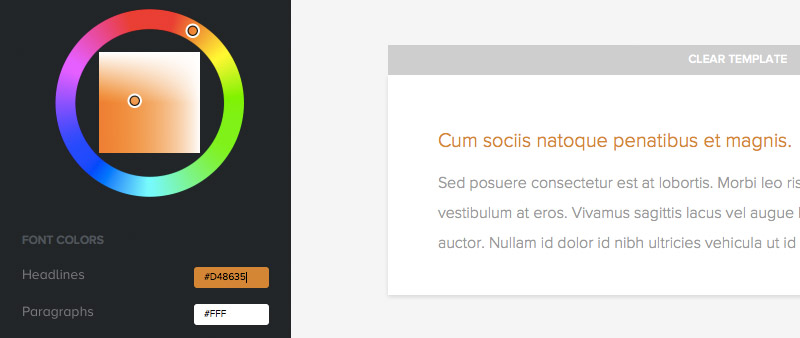
Change font colors
To allow the user to change the desired font color, simply add data-color to your element. Want to target multiple colors? Simply give each element the exact same tag name.<table> <tr> <td data-color="my element">Hello World</td> </tr> </table>
Give stylings to each newly created link
Sometimes you don't want to have a new link to be the main color. You want it bold and italic. We can give separate stylings by adding data-link-style to your desired TD, Table or any element really. If you want the new link to hold a data-color or data-size, simply add 2 other tags to your TD, table or any element, like so: data-link-color and data-link-size. Here's an example to turn each newly created link red and bold.<table data-link-color="Link" data-link-size="Link"Note, you still need to style each link.
data-link-style="font-weight: bold; color: red;"> <tr> <td>Hello World</td> </tr> </table>
Change background colors
The same as above, simply add the data-bgcolor tag.<!-- Change element background color --> <table data-bgcolor="my element"> <tr> <td>Hello World</td> </tr> </table>
Change border colors
Sometimes we are in a situation we want the user to be able to edit border colors. This can easily be achieved by adding the data-border-color tag. If you want to target a specific side for the border, simply use data-border-top-color, data-border-left-color, data-border-bottom-color or data-border-right-color.If you use the same tag as the data-border-color and data-bgcolor, the picker will merge as one.
<!-- Change element border top color -->
<table data-border-top-color="my element">
	<tr>
		<td>Hello World</td>
	</tr>
</table>
Change background images
To allow users to add a background image to your element, simply add the data-bg tag.<!-- Change background image --> <table> <tr> <td data-bg="my element">Hello World</td> </tr> </table>
Change images with the crop tool
StampReady automatically provides the crop tool for every image in the template. However, if you want the user to be able to change images without needing to set an aspect ratio, simply add the data-crop="false" tag to the desired image. With a just a few tags, we've learned how to get full control over the template.
Personalising Newsletters
Subscribers name
To present the subscribers name, simply use sr_name anywhere you want in the newsletter, like so:<!-- This tag will show the subscribers name --> <table> <tr> <td>sr_name</td> </tr> </table>But you can also use it in a url, like so:
<!-- This tag will show the subscribers name. Let's say the subscribers name is John Do. -->
<table>
	<tr>
		<td>
			<a href="http://www.website.com/sr_name.html">
				This link becomes http://www.website.com/JohnDo.html
			</a>
		</td>
	</tr>
</table>
Subscribers Email
Same as above, but use sr_email instead.<!-- This tag will show the subscribers email --> <table> <tr> <td>sr_email</td> </tr> </table>
Subscribers Registration Date
In case you want to present the registration date, you can do so by using sr_date.<!-- This tag will show the subscribers date --> <table> <tr> <td>sr_date</td> </tr> </table>
Unique Unsubscribe Link
This tag will return a custom URL your subscriber may unsubscribe to. You can do so by using sr_unsubscribe. Note, this tag returns a link. Make sure you use it in a href.<!-- This tag will show the unsubscribe link --> <table> <tr> <td><a href="sr_unsubscribe">Unsubscribe here</a></td> </tr> </table>
View Online Link
This tag will return a custom View Online link your subscriber may unsubscribe to. You can do so by using sr_view_online. Note, this tag returns a link. Make sure you use it in a href.<!-- This tag will show the unsubscribe link --> <table> <tr> <td><a href="sr_view_online">View Online</a></td> </tr> </table>
Create a Themeforest Demo
Join the developers program!
Let's start by joining the Developers program by going to your Account Settings page. Just check the little checkbox at the bottom and proceed. Once done, special options have been unlocked such as creating Themeforest Demos
Import your template
To create a demo, you need to import your StampReady compatible template. You can this on the New Campaign page, and simply press the import button on the upper right corner. We suggest making your template compatible by .zip file, as it will drastically speed up the process of generating thumbnails. Your zip file should contain a parent folder (most likely your template name), an images or img folder, and finally your index.html file.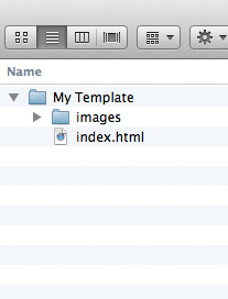
Export as a Themeforest Demo
In the editor, simply go to Export > Create Themeforest Demo. From here, fill in the name, price and checkout link of your template. Don't worry, this can be adjusted on your Themeforest Demos page as well.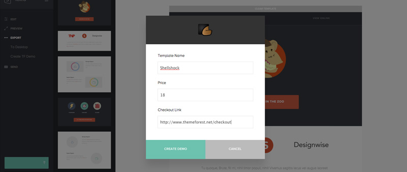
Overview of all your Demos
Simply go to Campaigns > Themeforest Demos within the dashboard. All your demos are present. You can delete, update and rename them.
Embed custom form on your website.
To receive callbacks when a visitor tries to register to list, you can choose for the custom form option. It's rather easy, as we provide straightforward callbacks.<!-- jQuery Plugin --> <script type="text/javascript" src="http://ajax.googleapis.com/ajax/libs/jquery/1/jquery.min.js">Your submit button contains your Public API key, list name and on click event handler. The submit function is written in the StampReady api.js. You may have noticed the 3 callbacks. Let's examine them quickly.
</script> <!-- StampReady API--> <script type="text/javascript" src="http://www.stampready.net/api.js"></script> <script> function error() { alert("error"); } function exists() { alert("exists"); } function success() { alert("success"); } </script> <body> <!-- Subscriber Name --> <input type="text" name="sr_name" placeholder="Your Name"> <!-- Subscriber Email Address --> <input type="text" name="sr_email" placeholder="Your Email"> <!-- Submit Button containing your Username --> <input type="submit" value="Register" api="XXX" opt="true" list="My List" onclick="submit();"> </body>
Success: When your visitor has registered successfully.
Exists: When your visitor is already registered to your list.
Error: When your visitor has entered invalid information.
Opt: Remove this attribute completely if you don't want your visitors to confirm their registration by email.
Name is not required: You can remove the name input if you don't want your visitors to exchange their name.
Copyright StampReady 2014 - info@stampready.net twitter